As you probably know, this Friday and this Saturday JoomlaDay Austria took place in Vienna. One of the interesting things was that an almost complete Joomla! 4 backend template development team was present. Members of this team presented news in this area at the end of the meeting. And although it was mainly small details, I was very pleasantly surprised.
So let's have a look at some details:
1) Login page
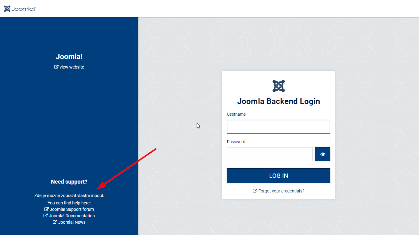
The login page now includes a left side panel to display any module. This can be very interesting for webdesigners when they create a special login page for their clients or special administration.
2) Dashboard
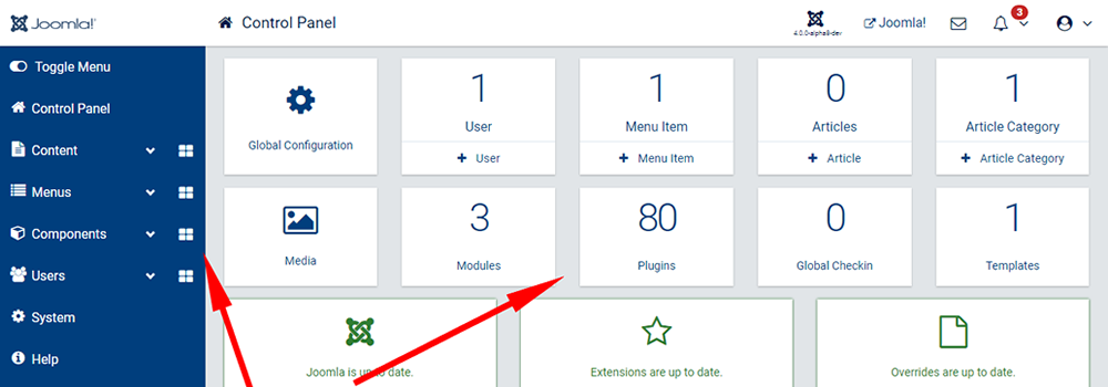
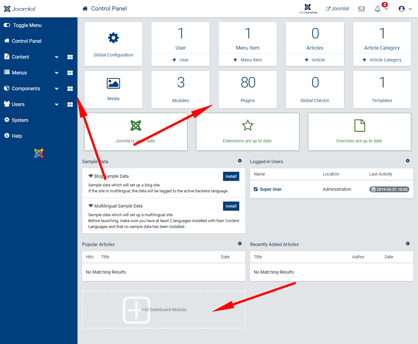
In addition to earlier drafts, link to plugins appears next to link to modules in dashboard. In the left menu you can see that even each main menu item can have its own dashboard. This will probably be used most for components. The last great thing is that you can insert a custom module on this dashboard, which will be appreciated by web designers who can create a personalized dashboard for their clients - exactly as the client needs..
3) Menu link - new item
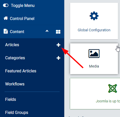
A new icon - the plus icon - appears in the link menu to add a new item. So, for example, in the article menu it is a shortcut for adding a new article. Right from the menu, you don't have to navigate anywhere.
4) Responsive design - display in mobile phones
A lot of changes have been made in this area, so that the administration displayed on the mobile device will follow new trends.
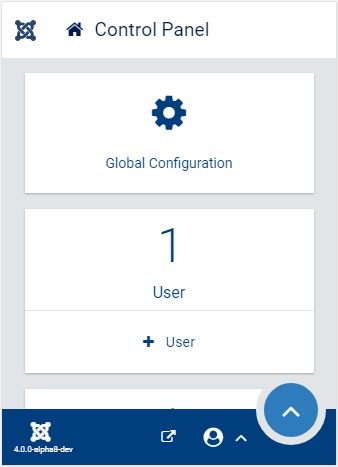
5) Buttons
It may seem funny, but the buttons and their layout are among the most discussed topics regarding administration. There are likely to be changes here.
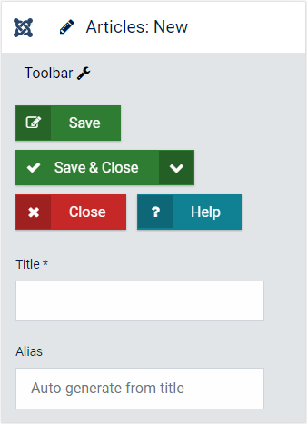
6) The smallest details
Compared to the previous versions, it will also delight the smallest details, such as displaying icons when loading background data, or changing the logo when resizing the box menu.
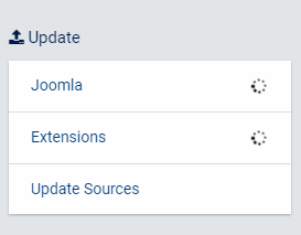
7) Changing the color scheme now very easily
You can simply change the template's color scheme in the template settings. This setting conceals a certain amount of intelligence, whereby there is always a certain contrast between the background and the font color. So that everything is readable. The webdesigner can easily create a color scheme for a particular customer. In addition, Joomla! logo can be change to customer logo.
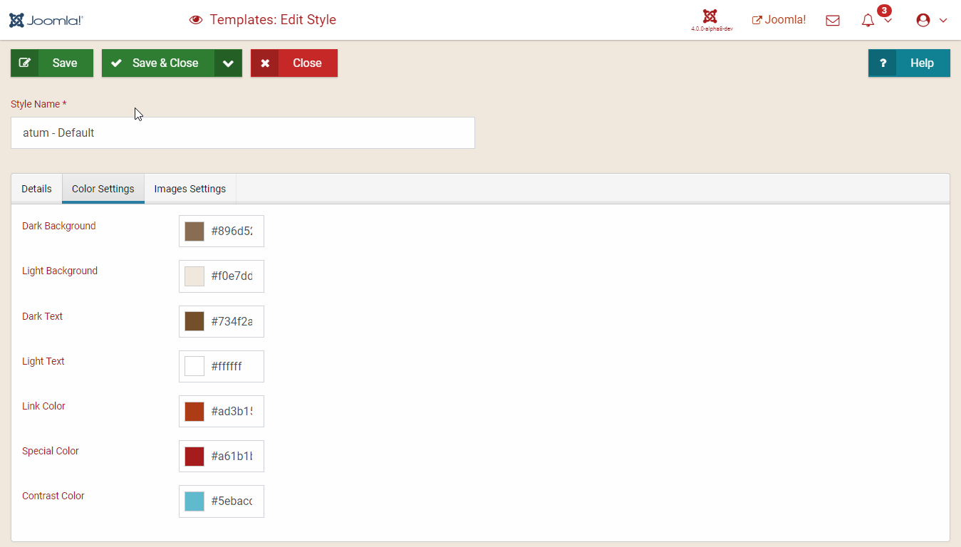
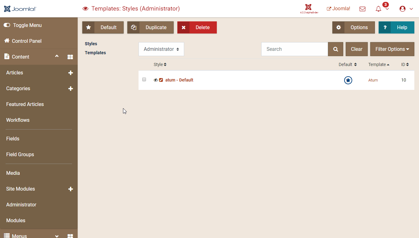
Of course, the latest features can be tried out, the development version of the template is available on GitHub:
The development version of the template can be installed for testing purposes as follows:
https://docs.joomla.org/J4.x:Setting_Up_Your_Local_Environment
If someone is following the discussions about Joomla! 4 administration template development, then he/she knows that the administration template is currently being intensively worked on and every detail is discussed in detail from all sides. Personally, I can confirm that although I am a supporter of the top menu (which no longer exists in Joomla! 4), I like the current status of administration in Joomla! 4. And even when using Joomla! 3 I miss some elements I learned to use in Joomla! 4.
